border属性在CSS3新增了很多样式,比如border-radius圆角样式,其中可以为border-color设置transparent值则实现了利用该样式绘制三角形等的能力。
transparent表示透明,透明不代表不存在。
在CSS2里面,只能为background-color设置该值,在CSS3里,只要能设置颜色的地方都可以使用。
一、绘制一个三角形
HTML结构如下:
<div class="b1"></div>
先设置基础样式,如下:
.b1{
width:100px;
height:100px;
background-color:#eee;
border:20px solid #0BA61B;
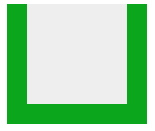
border-top:none;}你会发现,当top的边框没有的时候,上面是齐平的,如图:
继续设置样式,把左右两边的边框颜色设置为transparent。
.b1{
width:100px;
height:100px;
background-color:#eee;
border-left:20px solid transparent;
border-right:20px solid transparent;
border-bottom:20px solid #0BA61B;
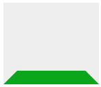
}这时候发现颜色为透明的边框和另一个有颜色的边框交界处是斜线,而不是齐平的线条。效果如图所示:
此时,只需要设置容器的宽高为0,清除背景色,就可以了。
.b1{
	width:0;
	height:0;
	border-left:20px solid transparent;
	border-right:20px solid transparent;
	border-bottom:20px solid #0BA61B;
	}
效果如图所示:

你还可以根据需要修改边框的值,如果把左右边框的值设置为底部边框的一半:
.b1{
	width:0;
	height:0;
	border-left:10px solid transparent;
	border-right:10px solid transparent;
	border-bottom:20px solid #0BA61B;
	}
效果如图所示:

反过来,可以设置一条边的透明值:
.b1{
	width:0;
	height:0;
	border-top:20px solid #0BA61B;
	border-bottom:20px solid #0BA61B;
	border-left:20px solid transparent;
	}
则效果如图所示:

还可以两条边没有,一条边透明,一条边有颜色:
.b1{
	width:0;
	height:0;
	border-right:20px solid transparent;
	border-bottom:20px solid #0BA61B;
	}
效果如图所示:

可以自己多多实验不同的搭配^_^
二、结合:before和:after伪元素实现特别的面包屑导航
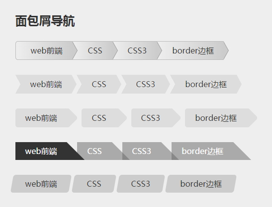
1、HTML结构
因为结构都是一样的,所以只列出其中一个,非常简单的列表。
<ul id="breadcrumb3" class="clearfix">
      <li><a href=""#" id="current">web前端</a></li>"
      <li><a href="&rvpu;#&rvpu;&hu;DTTμ/b&hu;μ/mj&hu;"
      <li><a href="&rvpu;#&rvpu;&hu;DTT3μ/b&hu;μ/mj&hu;"
      <li><a href=""#">border边框</a></li>"
</ul>
2、CSS样式
#breadcrumb li{
	float:left;
	}
#breadcrumb li a{
	display:block;
	position:relative;
	height:36px;
	line-height:36px;
	background-color:#ccc;
	padding:0 20px 0 30px;
	border:1px solid #bbb;
	border-right:none;
	color:#333;
	text-decoration:none;
	background-image: -webkit-gradient(linear, left top, right bottom, from(#eee), to(#ccc));
	background-image: -webkit-linear-gradient(left, #eee, #ccc);
	background-image: -moz-linear-gradient(left, #eee, #ccc);
	background-image: -ms-linear-gradient(left, #eee, #ccc);
	background-image: -o-linear-gradient(left, #eee, #ccc);
	background-image:linear-gradient(to right,#eee,#ccc);/*线性渐变*/}
#breadcrumb li:first-child a{
	-webkit-border-radius:5px 0 0 5px;
	-moz-border-radius:5px 0 0 5px;
	border-radius:5px 0 0 5px;}
#breadcrumb li a:after,#breadcrumb li a:before{
	content:"";
	position:absolute;
	right:-10px;
	bottom:0;
	z-index:10;
	border-left:10px solid #ccc;
	border-top:18px solid transparent;
	border-bottom:18px solid transparent;
	}
#breadcrumb li a:before{
	border-left-color:#999;
	right:-11px;
	z-index:9;}
#breadcrumb li:last-child a:after{
	right:-9px;/*最后一个li的a:after的right边距往右移9px*/
	}
#breadcrumb li:last-child a:before{
	right:-10px;}

#breadcrumb li a:hover{
	color:#400000;
	background-color:#eee;
	background-image:none;
}
#breadcrumb li a:hover:after{
	border-left-color:#eee;}


/*--------------------------------------------*/
/*第二个面包屑导航样式*/
#breadcrumb1 li{
	float:left;
	margin:0 10px;}
#breadcrumb1 li a{
	position:relative;
	display:block;
	padding:0 20px;
	line-height:38px;
	text-align:center;
	background-color:#ddd;
	text-shadow:0 1px 0 rgba(255,255,255,.5);
	}
#breadcrumb1 li a:hover{
	background-color:#62B31A;}
#breadcrumb1 li a:before{
	content:"";
	position:absolute;/*必须是apdiv类的定位,否则默认有高度。*/
	border-left:10px solid transparent;
	border-top:19px solid #ddd;
	border-bottom:19px solid #ddd;
	top:0;
	left:-10px;
	}
#breadcrumb1 li a:hover:before{
	border-color:#62B31A #62B31A #62B31A transparent;}
#breadcrumb1 li a:after{
	content:"";
	position:absolute;
	right:-10px;
	top:0;
	border-top:19px solid transparent;
	border-bottom:19px solid transparent;
	border-left:10px solid #ddd;}
#breadcrumb1 li a:hover:after{
	border-color:transparent #62B31A transparent #62B31A;}
/*--------------------------------------------*/
#breadcrumb2 li{
	float:left;
	margin:0 30px 0 0;}
#breadcrumb2 li a{
	position:relative;
	display:block;
	line-height:38px;
	padding:0 20px;
	background-color:#ddd;
	-webkit-border-radius:5px 0 0 5px;
	-moz-border-radius:5px 0 0 5px;
	border-radius:5px 0 0 5px;}
#breadcrumb2 li a:after{
	content:"";
	position:absolute;
	width:30px;
	height:30px;
	top:4px;
	right:-17px;
	-webkit-border-radius:5px;
	-moz-border-radius:5px;
	border-radius:5px;
	background-color:#ddd;
	-webkit-transform:rotate(45deg);
	-moz-transform:rotate(45deg);
	transform:rotate(45deg);/*顺时针旋转45度*/
	}
#breadcrumb2 li a:hover,#breadcrumb2 li a:hover:after{
	background-color:#6AE4E8;}
/*--------------------------------------------*/
#breadcrumb3 li{
	float:left;
	margin-right:-15px;}
#breadcrumb3 li a{
	position:relative;
	display:block;
	padding:0 20px;
	color:#fff;
	border-right:36px solid transparent;
	border-bottom:36px solid rgba(102,102,102,.5);
	height:0;/*让文字在边框上*/
	line-height:36px;/*在边框里纵向居中*/
	}
#breadcrumb3 li a:hover{
	border-bottom-color:rgba(36,196,230,.7);}
#breadcrumb3 li a#current{
	border-bottom-color:#333;
	z-index:2;/*层级上升,可以压住旁边的对象*/
	}
/*--------------------------------------------*/
#breadcrumb4 li{
	float:left;
	margin-right:20px;}
#breadcrumb4 li a{
	display:block;
	line-height:36px;
	padding:0 20px;
	position:relative;
	background-color:#ccc;}
#breadcrumb4 li a:before,#breadcrumb4 li a:after{
	content:"";
	position:absolute;
	width:14px;
	height:36px;
	left:-7px;
	bottom:0;
	background-color:#ccc;
	-webkit-border-radius:5px 0 0 5px;
	-moz-border-radius:5px 0 0 5px;
	border-radius:5px 0 0 5px;
	-webkit-transform:skew(-10deg);
	-moz-transform:skew(-10deg);
	-ms-transform:skew(-10deg);
	transform:skew(-10deg);/*逆时针旋转10度*/
	}
#breadcrumb4 li a:after{
	border-radius:0 5px 5px 0;
	left:auto;
	right:-7px;
	}
#breadcrumb4 li a:hover,#breadcrumb4 li a:hover:after,#breadcrumb4 li a:hover:before{
	background-color:#E9E043;}
/*#breadcrumb4 li a#current1:before,#breadcrumb4 li a#current1:after{
	content:normal;}*/
	/*如果不需要:after等伪元素的内容,可以把content设置为normal*/
该万博manbext3.0首页登录需要对伪元素知识点和相对绝对定位有了解才能轻松搞定哦,还有一点变形效果(transform)是额外内容。
如果有疑问,欢迎给我留言,或者QQ交流。
发表评论:
◎请发表你卖萌撒娇或一针见血的评论,严禁小广告。